JOURNAL

Art Journal of Julie Breton abstract painter, view new artwork, studio update & inspiration. | Journal de Julie Breton artiste peintre. Voyez les oeuvres, l'atelier & ce qui m'inspire.

MÉMOIRES ABSTRACT COLLAGE SERIES

JULIE BRETON | MÉMOIRES No.4 - abstract collage

JULIE BRETON | MÉMOIRES No.4 - abstract collage

JULIE BRETON | MÉMOIRES No.2 - abstract collage

JULIE BRETON | MÉMOIRES No.2 - abstract collage

The MÉMOIRES series explores the fragmented and shifting nature of memory. Drawn from photographs, places and moments remembered, each work brings together fragments of colour, line and image to suggest something familiar yet difficult to fully retrieve.

Working with translucent paper, graphite, coloured pencil, acrylic, canvas and found imagery, I build the compositions in layers—allowing marks to appear, disappear and overlap.

Vintage photographs and postcards discovered in local antique shops introduce traces of other lives and places, blurring the boundary between personal memory and imagined histories.

Rather than documenting a particular moment, the work evokes the way memories are return to us: incomplete, altered by time and often unexpectedly vivid, creating compositions reminiscent of the fleeting moment.
GLASSHOUSE ABSTRACT SERIES

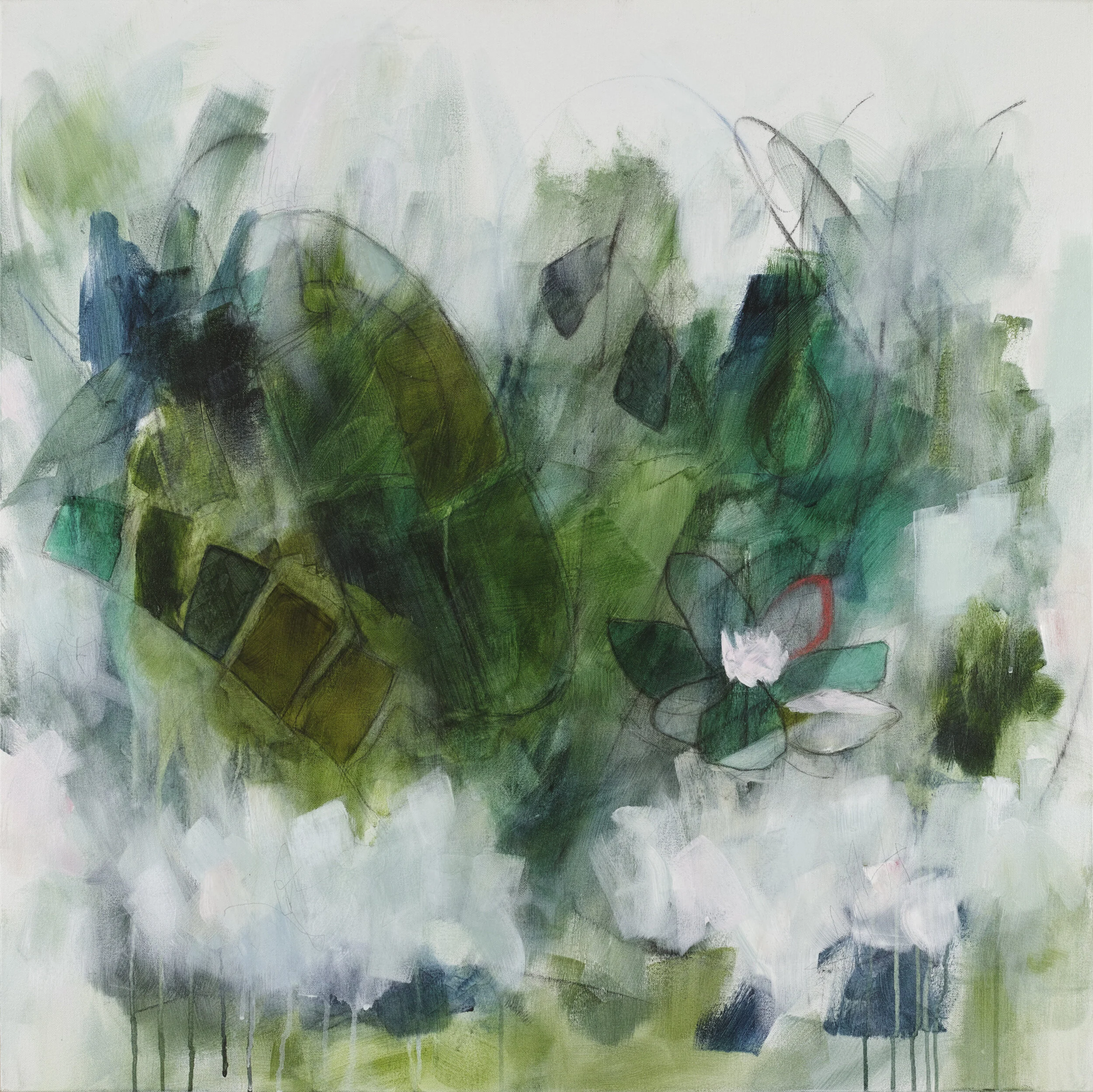
JULIE BRETON ART | TROPICAL LUST

JULIE BRETON ART | TROPICAL LUST

The GLASSHOUSE series is inspired by the Victorian glasshouses and conservatories that once symbolized prosperity, discovery, and progress. Today, many survive only as remnants of another era—abandoned structures slowly reclaimed by nature.

I am fascinated by vintage photographs of their opulent grandeur and imagine them filled to capacity with lush tropical plants and rare botanicals competing for light beneath soaring glass ceilings. Built to showcase exotic collections from around the world, these extraordinary spaces reflected the optimism and ambitions of a rapidly changing society.

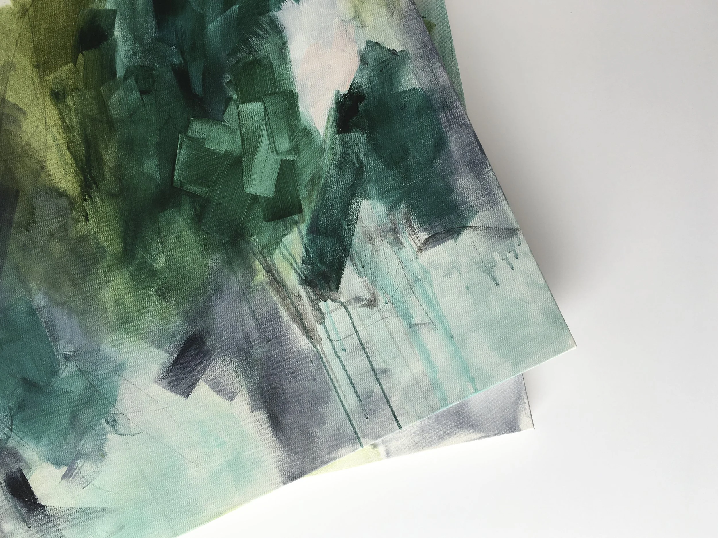
JULIE BRETON ART | WORK IN PROGRESS

As the modern era emerged and cultural values shifted, many of these magnificent structures fell into decline. Their fading grandeur serves as a reminder that even the most ambitious creations are shaped by the passage of time.

In this series, lush botanicals coexist with unexpected colours, abstract forms, and contemporary mark-making. The work explores the intersection of nature and culture, past and present, creating imagined landscapes where history, memory, and transformation converge. You can follow my progress with this series on Instagram below.

LIVING WITH ART

CURATE & DISPLAY | KITCHEN RENO - ART BY BERIT MOGENSEN LOPEZ

TIFFANY GRANT RILEY | KITCHEN RENO - ART BY BERIT MOGENSEN LOPEZ

How often do you see a piece of art you love and think, “maybe someday”? There are many ways to incorporate art into your everyday life without completely rethinking a room.

UK interior photographer Tiffany Grant Riley has a wonderful approach to interiors—minimal, considered and full of personality. Her latest kitchen renovation, featured on her blog Curate & Display, is a beautiful example. Set within her Victorian Era Chatham home, the space combines deep blue cabinetry, warm wood and carefully chosen objects, including artwork by Berit Mogensen Lopez and one of my own pieces.

CURATE & DISPLAY | KITCHEN RENO - ART BY JULIE BRETON

TIFFANY GRANT RILEY | KITCHEN RENO - ART BY JULIE BRETON

When it comes to artwork, less can often be more. A small, thoughtfully placed piece can bring colour and character to a room without overwhelming it. I especially love how my work sits against the Nordic Blue cabinetry here—the restrained palette of the room gives the artwork its own quiet presence.

PRÉMONITION

JULIE BRETON ART | PRÉMONITION ABSTRACT PAINTING

JULIE BRETON ART | PRÉMONITION ABSTRACT PAINTING

JULIE BRETON ART | PRÉMONITION DETAIL

JULIE BRETON ART | PRÉMONITION DETAIL

This painting from the Émotions series, inspired by the classic French novel Madame Bovary, is one of my favourites. For a few days, I had been looking for the right title, but nothing quite fit.

Then, on the eve of my birthday, a meteorite entered the atmosphere above Nelson. The mountains lit up in a brilliant flash, followed by a deafening rumble that shook the house. A rather rare and dramatic way for the universe to make a suggestion. The next morning, the painting had its title: Prémonition.

ÉMOTIONS

JULIE BRETON | PASSION

JULIE BRETON | SCENTED BRISE

Émotions is a new painting series inspired by Gustave Flaubert’s Madame Bovary. Set in 19th-century provincial France, the novel caused a sensation when it was published and Flaubert was even prosecuted for obscenity. More than 150 years later, its beautiful prose and remarkably modern observations on love, desire and the expectations we place on life have made it a masterpiece of French literature.

An infinity of passion can be contained in one minute, like a crowd in a small space.
— Gustave Flaubert, Madame Bovary

I was especially drawn to Flaubert’s descriptions of the French countryside and to Emma Bovary’s restless longing for a life more beautiful and passionate than the one around her. There is something fascinating in the contrast between the quiet provincial landscape and the intensity of her inner world. Émotions grew from that tension—landscape, longing, beauty and desire translated into colour, gesture and paint.

WORK IN PROGRESS

JULIE BRETON ART | WORK IN PROGRESS

I’m currently working on a new series inspired by Gustave Flaubert’s Madame Bovary. I’m drawn to the novel’s vivid descriptions of the French countryside and the contrast between its quiet provincial setting and Emma Bovary’s restless inner world—her longing, desire and search for something beyond the ordinary.

JULIE BRETON ART | DETAIL ABSTRACT PAINTING

The paintings are built slowly through layers of charcoal, Conté, pastel and acrylic paint, allowing marks and drawings to appear, disappear and re-emerge beneath translucent layers of colour. Rather than illustrating the novel, I’m trying to capture its atmosphere—the landscape, shifting moods and emotions that seem to linger just beneath the surface. Follow along on Instagram to see the series take shape.

SKETCHBOOK

JULIE BRETON | SKETCH inspired by Ellsworth Kelly

This year, I’ve decided to find a way of sketching that works for me. I usually work on large canvases, where I have plenty of room to move, experiment and make a bit of a mess. Sketchbooks, by comparison, have always felt a little too precious and confining. So instead, I’ve started working on loose 3 × 4-inch pieces of paper.

I naturally reach for the same materials I use in my paintings—charcoal, graphite, pastel, acrylic and watercolour—but they aren’t always very practical on a sketchbook page. This year I want to experiment more with pen, markers, Conté and oil pastels, and see where they take me.

JULIE BRETON | PASTELS

I also want these drawings to be something quite separate from my work on canvas. Sketching gives me a chance to study the work of artists I admire and learn from the way they observe and reduce a subject to its essential lines. This drawing was inspired by Ellsworth Kelly.

GREEN OBSESSION

JULIE BRETON | WORK IN PROGRES

JULIE BRETON | COLOUR SWATCH

Lately I’ve been obsessed with mixing greens—olive, moss, teal and everything in between—searching for the perfect shades to bring into my Émotions series. I’m especially inspired by the colours found in moss, lichen and decay, where greens become muted, layered and unexpectedly beautiful.

Here is a glimpse of the work in progress, along with some of the colour studies scattered around my studio.